
How to create a flippable card with Svelte, HTML & CSS.
Summary
In this guide we will go through the process of creating a simple card component that can be flipped with a visually appealing animation via a boolean input prop.
The complete source code can be found here. It you just want to make use of the flippable card library, it can be found on NPM here.
How to create the component
First we will create a new svelte component for our flippable card. I have named mine Flippable.svelte. I am using typescript, feel free to remove typings/lang if this is not your preference.
I then define some input props. flip will control which card face will appear to face users. height and width do exactly what youd expect, they specify the size of the card.
<script lang="ts">
    export let flip = false;
    export let height: string;
    export let width: string;
</script>
I then structure the html tags and apply the necessary styles. For this component I am using named slots in Svelte to allow the card faces to be dynamically set, this allows for re-usability. If this concept is new, it is a method of passing multiple blocks of html in the parent component to then slot into this child component in the relevent positions.
<div class="flip-card" style="width: {width}; height: {height};">
    <div class:flip class="flip-card-inner">
        <div class="flip-card-front">
            <slot name="front" />
        </div>
        <div class="flip-card-back">
            <slot name="back" />
        </div>
    </div>
</div>
The key transform is managed by the dynamically applied class flip. Next we need to apply the appropriate css.
<style>
    .flip-card {
        background-color: transparent;
        perspective: 1000px; /* Remove this if you don't want the 3D effect */
    }

    /* This container is needed to position the front and back side */
    .flip-card-inner {
        position: relative;
        width: 100%;
        height: 100%;
        text-align: center;
        transition: transform 0.8s;
        transform-style: preserve-3d;
    }

    .flip {
        transform: rotateY(-180deg);
    }

    /* Position the front and back side */
    .flip-card-front,
    .flip-card-back {
        position: absolute;
        width: 100%;
        height: 100%;
        -webkit-backface-visibility: hidden; /* Safari */
        backface-visibility: hidden;
    }

    /* Default is facing away */
    .flip-card-back {
        transform: rotateY(180deg);
    }
</style>
How to use the component in our application
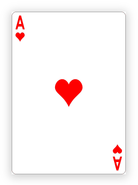
Finally we can add the component to our application. By applying slot names to the images we ensure they are dropped into the corresponding slots in the component. I have also added a box shadow to further add to the 3D feel.
<script lang="ts">
    import Flippable from './lib/Flippable.svelte';
    let flip = false;
</script>

<button on:click={() => (flip = !flip)}>Flip!</button>

<main>
    <Flippable height="337px" width="234px" {flip}>
        <img slot="front" src="/card-front.png" />
        <img slot="back" src="/card-back.png" />
    </Flippable>
</main>

<style>
    img {
        box-shadow: 0px 3px 18px 3px rgba(0, 0, 0, 0.2);
    }
</style>